00:00 / 25:14
Episode Transcript
- MichaelAaron: So welcome back, everyone, to Behavioral Science for Brands, a podcast where we bridge the gap between academia and marketing. Every other week we sit here and we decode the science behind some of America's most successful brands. I'm MichaelAaron Flicker.
- Richard: And I'm Richard Shotton.
- Richard: Today we're talking notepads. Shutter clicks and spreading innovation. Let's get into it. So, Richard, today we're sitting here talking about Apple computers this summer named the most valuable company in the world, valued at $3 trillion at the end of 2022.
- MichaelAaron: One out of every two smartphones in Americans pockets were made by Apple. And so while there may not be anything new to say about Apple giving how much coverage it's gotten for us as brand guys who care not just about ad campaigns, but care about building companies that thrive in the world. Apple is really an interesting case study for us both about thinking about the whole brand and to me, it's more than just amazing innovation, which they've been at the top of their game for 20 years.
- MichaelAaron: And it's more than just amazing. Ad campaigns, which they've had many. It's the way they so everything together for a consistent, repeatable brand experience that I think is one of Apple's most sterling achievements. The brilliance for me is that the experience using the product matches the way that it's portrayed at every touchpoint. So Apple is first and foremost selling an idea, a mindset that everything should work together in one ecosystem.
- MichaelAaron: So whether you're holding an iPhone, working on a mac, or have the Apple Watch on your wrist, everything works in one ecosystem. The same when you try to order from them, whether you're buying online, in-store on the phone. It's all one ecosystem and you can really feel that when you walk into a retail store, it feels different than other computers or other technology centers.
- MichaelAaron: And famously, Microsoft created Microsoft stores trying to compete with Apple using the same lightweight interiors and the same clean and crisp retail environment. It just didn't connect in the same way because it was just one element of the ecosystem that Apple selling one universal premium yet approachable brand that makes people feel excited about technology. But also welcome to be a part of this.
- MichaelAaron: Innovation has really been a hallmark of what has made Apple so successful. And at the end of the day, building brands is really about creating value for people in their lives and then having them trust that when they come back time over time, they're going to continue to get value in exchange for taking money out of their wallets and giving it to us.
- MichaelAaron: Steve Jobs has openly thought about human psychology. He wrote about it. He talked about it, and specifically how to get people to change and try new things. So for us as behavioral science enthusiasts, there's a lot to get excited about with Apple. Richard, you know, that's the opening. That's the set up. What's your take on how Apple has used behavioral science?
- Richard: Well, you made a point there around that. Steve Jobs is a master of courage, paying people to try new things. One of the tactics here he honed some psychology was an idea called design SKEUOMORPHISM. So his argument was that there are competing demands in people's lives that they are both attracted to the new and they also fear it.
- Richard: So he said there's near failure and near phobia. We both feel that we're scared of the new, you know, might be a danger, but we also are attracted to X and might bring rewards. So his argument and this was summed up best by an Atlantic writer called Derek Thompson. He said the goal to sell something is if it's familiar, make it surprising.
- Richard: And if it's surprising, make it familiar somehow. Steve Jobs is a master of that. If you think back to the original iPhone design, when the iPhone was a surprising new bit of technology, they did all sorts to try and make that feel a little bit more familiar
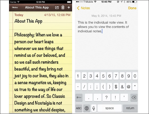
- MichaelAaron: things like when you open the notes app on the first iPhone, the app showed a lined yellow piece of paper just like a normal legal pad spiral lining in the binding, right?
- MichaelAaron: Handwriting instead of computer type when you typed out the letters.
- Richard: Yeah, exactly. And that might feel like just a random design choice. But by comparing this new technology to the physical real world, existing alternatives, it gave us an element of comfort. So when the iPhone was shockingly new, you needed to have these familiar reminders. But what happened over time was as people became used to their iPhone, the need for those familiar reminders was minimized.
- Richard: And you see from the design, it's become more and more abstract. That spiral notebook you mentioned that's gone. You don't get that any longer. You don't get font that looks like handwriting is much more crisp and clean now.
- MichaelAaron: And you know where the notes app you can at least start to understand. I think it used to be called Notepad too.
- MichaelAaron: I'm not sure about that, but with the notes app it made sense what it might be. Think about trying to teach people what deleting a file meant. And in the original Macs, it was a trash can on the computer desktop. You would drag a file into it, you would hear the sound of crunching paper and you would see it literally animate a piece of paper being crunched up and thrown into a trash bin.
- Richard: Yeah, that's an interesting zone because they're not just using visual symbols, they're accompanying that with familiar sounds. I can imagine that some people are skeptical of this. And one of the things I love about behavioral science is none of this is ever just speculation. The great in behavioral science is everything has to come back to peer reviewed experiments.
- Richard: But there were quite a few experiments to back up this principle of what might be known as optimal newness. So the study in question comes from Karan Lakhani 2014 study that kind of goes out and recruits 142 world class researchers and he shows them a variety of different research proposals and they have to score these research proposals on their potential impact.
- Richard: And what Lakhani had done beforehand was group these research proposals into themes. So according to with a very novel, quite novel, quite familiar or very familiar. And what Lakhani found was that the very novel research proposals got scored very low, but likewise the very familiar ones scored very low as well.
- MichaelAaron: Yeah,
- Richard: it was again, this sweet spot of optimal newness that people want enough reassurance of, a little bit of familiarity, but not so much that it becomes boring or so they don't want, so much novelty that it becomes untethered and scary.
- Richard: So trying to work out what's your existing position, what's the technology introducing? If it's surprising, make it familiar, as Derek Thompson was, say, or if it's familiar, try it.
- MichaelAaron: Add a dash of surprising feels wildly applicable to so many brands and so many marketers who are bringing new products to the market. You know, either new categories or new products within existing categories of roadmap for how they might think about this.
- Richard: Yeah, absolutely. Absolutely. It's something I think a people who pitch films are very good at it.
- MichaelAaron: Yeah,
- Richard: the alien supposedly described as Jaws in space. You know, what is the what's the proxy that you can use to immediately establish what your product represents?
- MichaelAaron: So this idea of finding the sweet spot, Richard, between, you know, new but the familiar is not a concept that Steve Jobs came up with first.
- MichaelAaron: This is a longstanding principle that has quite a bit of documentation.
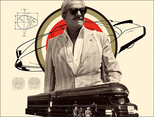
- Richard: Yes, there are examples of designers, inventors through history using the same approach. Famously, there was a designer called Raymond Loewy. He was responsible for the BP and Shell logos, the lucky stripe, cigaret, packaging, a Greyhound bus design, all sorts of beautiful inventions. And he had a phrase, famous phrase of most advanced yet acceptable.
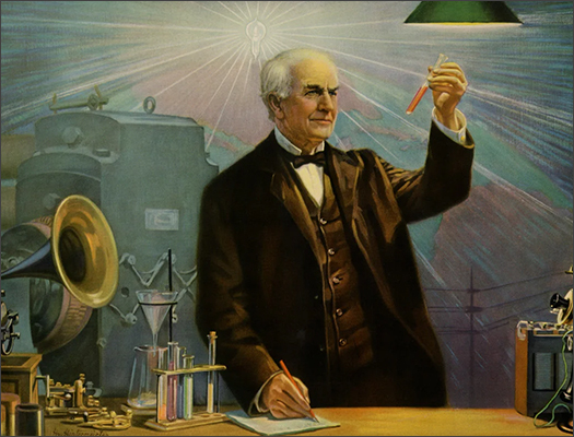
- Richard: So he was trying to work out well when did that near phobia sorry, when did that near failure tip in to near phobia or before him. You go back to Edison. Edison never had a phrase for what he did, but he had the same principle when he was trying to encourage American households to switch to electricity rather than using, you know, naked flames and gas.
- Richard: Everything he did with electric lightbulbs was to try and make them familiar. So if you think about it, an electric light bulb doesn't really need a light shade. The purpose of those light shades was to link them back to candles. People that had those light shades to stop gusts of winds guttering out the candles. They repeated it not because the technology required it,
- MichaelAaron: but to make it familiar.
- Richard: Yeah, it made it familiar. He even capped the wattage of the bulbs, the technology was there already when he launched to be brighter, but he capped the brightness at the same level as light as a candle to try and make it again more familiar. So great observers of human nature have noticed this tension between near failure and near phobia long before jobs or even Raymond Loewy
- MichaelAaron: So striking this balance is one thing that Apple has done extremely well for a long time.
- MichaelAaron: But it's not the only interesting behavioral science principle they're using to help succeed.
- Richard: No, Apple, of all the brands that we've discussed, are probably the one who most consistently use a broad variety of psychological insights. So the other thing they do very well is when it comes to their copywriting, they are masters of using concrete language rather than abstract language.
- Richard: The value of this can be shown in a 1972 study by a University of Western Ontario psychologist called Ian Begg. So very, very simple study. He recruits a small group of people and he reads out a list of words them. And some of those words are what he calls abstract. So subtle facts or basic truth, others of what he would call concrete.
- Richard: These are tangible, physical visualize below items squared or Whitehorse. He then reads these lights out. He gives people a few seconds to think about things, and then he asks people to write down as many as they can remember. And his key finding is people on average remember 9% of the abstract words. Those are the intangible things, but they remember 36% to four times as many difference.
- MichaelAaron: Yeah
- Richard: Four times as many of the concrete phrases and pegs argument. His vision is the most powerful of all physical sentences. So if you use language that can be visualized, it becomes sticky. A memorable. But if you use language that can't be visualized is too abstract, then that is very, very easy to forget.
- MichaelAaron: Yeah. So literally being able to see the concept in your mind when you say it makes it stickier.
- Richard: If I say square door for most people, almost unbidden, the square door will pop up in the mind. If I say basic truth, what is there to imagine? You can't picture truth. So it's that difference between what can be visualized and what come.
- MichaelAaron: And this is really when you look across so much of product advertising, so much use non tangible words of things that can't be imagined.
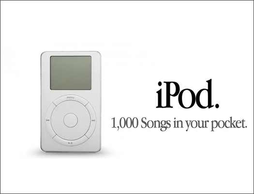
- Richard: Absolutely. That this is the norm of how most brands behave. Most brands talk about value premiumness, trustworthiness, provenance. They use all these pieces of terminology that simply can't be pictured. Now, you think back, though, to what Apple did when they launched the iPod. So just like every other MP three player, they wanted to convey the abstract benefit of memory and storage.
- Richard: Now, what most marketers did in that situation Philips, Sony, Samsung, they all talked about how their storage was 148 megabytes. And you cannot picture megabytes, You certainly can't picture 128. So they fell into the trap of combining an abstract objective with abstract language. Now, compare that with Apple. The same abstract objective of memory. But what they did was convert that into much more concrete language.
- Richard: They talked about a thousand songs in your pocket. Now you can picture a pocket, you can imagine a song. That's why that line became so memorable. So I think something that they have been very good about is recognizing that even though you might have an abstract objective, you can't communicate that directly. You've got to translate something that's Phish realizable.
- MichaelAaron: And to drive back to why we chose to feature Apple in this episode, if we are pushing innovation, if we are trying to introduce new products and existing categories or whole new categories. Having concrete things helps make it more understandable and more memorable to the consumer.
- Richard: Yes, and you can see this. It's no and certainly one to suggest that there was once this problem in the early 2000 with three players.
- Richard: Now it's all resolved. Think about sell pro providers. Think about broadband providers. They talk about, you know, the gigabytes you get. They're still making the same mistake today. I think it is still something that many memory brands can apply.
- MichaelAaron: Mm hmm. Mm hmm. So we can take this idea, Richard, of concrete and abstract, and apply it more than just the copyright.
- Richard: Yeah,
- MichaelAaron: or just the imagery and copy that we use. We were talking before the show started about the concept of fluent devices. You want to explain that to everyone?
- Richard: Absolutely. So there's a big research agency called System One. And one of the research projects they have done is go through the UK equivalent of the FSA. So in the UK, we have thousands of award entries into what's called the IPR Effectiveness awards, very rigorous.
- Richard: You have to go to great lengths to prove that it was your advertising that drove the success of your brand, often for econometrics. And they've looked at all these entries and they've looked at all the long term campaigns. And one of the most interesting findings was campaigns that have what they call a fluent device tend to be much more successful than campaigns that don't have a fluent device when they use this term.
- Richard: Fluent device, what they mean is a character or mascot who represents the brand, who is integral to the the drama of the ad.
- MichaelAaron: So example would be Tony the Tiger from Frosted Flakes.
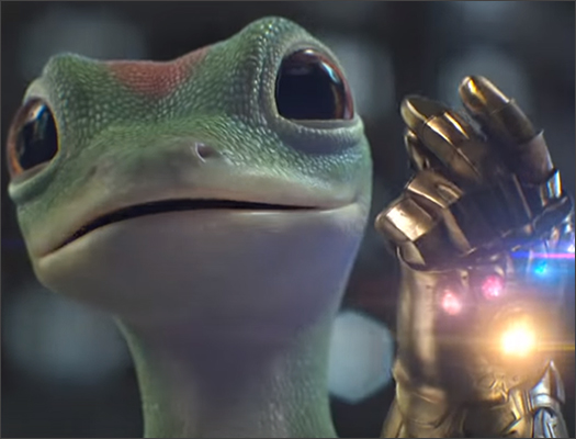
- Richard: Yeah. Or Geico Gecko Naga. The key thing here is that the character isn't just a logo at the end, he or she is what the drama revolves around.
- Richard: So it's a crucial part of the ad all the way through. And to bring this back to concreteness, think about what some of those brands try to convey at great value for Geico Gecko or great taste. Those are abstractions. Those are very forgettable. But what we can remember is a lizard. We can remember a tiger. If you can create a symbol for your brand that you pack with some of these intangible attributes that's turning abstract into concrete.
- MichaelAaron: Yeah. And the effect is that the consumer, the buyer has a reaction to that character when they might not have a reaction to the actual attributes of the brand itself.
- Richard: Yes. Yes. Unfortunately, even though there's certainly a lot of evidence for the type of science in sort of concreteness and there's this new evidence about fluent devices, unfortunately, another bit of data from system one, certainly in the UK, is that the proportion of ads using fluent devices is in quite.
- Richard: It's something that we associate with the 1970s, I think in the 1980s. You know, if you go back to that era of advertising and the Marlboro Man, the Jolly Green Giant, it was something that was very regular.
- MichaelAaron: Yes.
- Richard: But now maybe it feels a bit too simplistic to people work in agencies. But again, what we should be interested in is not whether something is sophisticated or fancy or erudite, but whether it's effective.
- Richard: There's a growing body of evidence, these fluent devices are.
- MichaelAaron: Yeah, it reminds me of a previous episode where we talked about the principal agent.
- Richard: Yes.
- MichaelAaron: Yeah. Where the principal being the brand has one thing that would be best for it, but the agent being the brand manager or the agency has other things that they're most concerned about.
- MichaelAaron: Raises and promotions and bonuses. And those two successes are not always aligned.
- Richard: Yeah. I mean, one thing that someone working at marketing wants to believe is that they are I mature sensible person. May be saying let's use a lizard as a mascot or a giant green man doesn't feel like we're working in a sophisticated game industry. But you know what works is often what's different from more sophisticated.
- MichaelAaron: Yeah. And I think we're talking about a really challenging concept, which is how do we take abstract ideas and make them memorable and readily accessible at the point at the time when someone's going to make a decision to buy your brand.
- MichaelAaron: And these are what are they called
- Richard: Fluent devices. I don't know why they gave them such a complicated name.
- Richard: Yeah.
- MichaelAaron: Which. Which is almost fighting.
- MichaelAaron: Yeah. Yeah. Concept of lower device.
- Richard: I mean, they don't have people who aren't talking about them. I think, again, it's like the name is so important. It sounds a little bit too academic, but.
- MichaelAaron: Yeah.
- Richard: But I think their research is really good.
- MichaelAaron: Yeah. You know, so it occurs to me that using concreteness kind of brings you down to simpler concepts that why fluent devices are so effective because they're simple and you can and memorable.
- MichaelAaron: And there's some data, there's some studies to prove that as well.
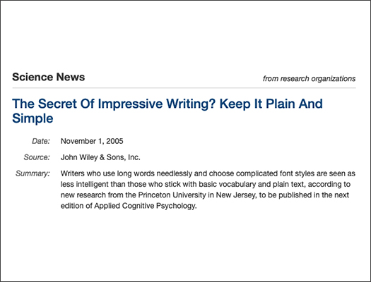
- Richard: Yeah. There are studies that suggest if you use unnecessarily complex language, it reflects badly on you. If you use a simpler alternative. It reflects well. So the study in question is probably the greatest academic paper title ever. I'm ready. It's time you Oppenheimer again. And the paper is called The Consequences of erudite vernacular utilized irrespective of necessity.
- MichaelAaron: I have no idea what that means,
- Richard: nor do I. But then he has a colon, and then it says problems with using long words and needless. Like it's a rare flash of academic humor. And what he does in the study, he gets these abstract acts of academic articles. So these little prices that run at the beginning of the journal articles, he takes those and he gets people to read them.
- Richard: And generally those abstracts are overblown in their language. They use unnecessary, convoluted words. So some people read the original abstracts with convoluted, overblown language. Other people read basically the same abstract. But Oppenheimer's replaced the complex words with simple alternatives. And in that second scenario, when that group is asked to rate the intelligence of the author, they write the intelligence something at 30% more than the original group.
- Richard: So the complicated version is that Oppenheimer's argument, which runs counter to how most business people behave, is if you use complex language, it doesn't make the audience think you're intelligent, it makes them irritated, confused, and they'll blame you the right of that. If you use simple language, people will assume you're more intelligent. It reflects well on you. So one lesson for brands is even if you work in a very important subject matter like finance, health care, try and write as plain as possible.
- MichaelAaron: It's not unlike what great creatives will say, which is that it's a reductive act. Keep taking away from the art until it's the most basic and simple form. It's kind of the same concept. Keep removing the complexity of the words until it's simplest message.
- Richard: Absolutely. It's a theme that you see outside of that industry amongst creatives. And George Orwell, Ernest Hemingway say the same thing again and again.
- Richard: I think Hemingway said something like, you know, I know all the hundred dollar words. I just choose not to use them. Yeah. Now, they saw there was a value in plain speaking.
- MichaelAaron: Yeah. So, Richard, as we do, we like to do a wrap up at the end of each episode to make sure everyone gets the clear takeaways from each episode.
- MichaelAaron: Today, we want people to remember
- Richard: three big things. Firstly, remember the idea of optimal newness.
- MichaelAaron: Mm hmm.
- Richard: Think about the competing drawings of near phobia, near failure. So think to yourself, Is my product radical? In which case, then you have to consider ways of making it more familiar. If you have a familiar product, think of ways to make it more surprising.
- Richard: So that's the first principle. The second one is visions, the most powerful of our senses. We struggle to remember abstractions. Make sure the language you're using is as concrete as possible. Make sure people can visualize the words that you're saying.
- MichaelAaron: Yeah.
- Richard: And then the third and final there is this added benefit of simplicity that if you use concrete language, you tend to speak simply.
- Richard: And Oppenheimer's study shows that it isn't just about boosting understanding levels. It also reflects very well on the communicate. You'll be seen as high status if you use simple words.
- MichaelAaron: So as we come to a close today, we're talking about Apple. They're pushed to innovation. I got to ask Richard Mac or PC
- Richard: PC. I'm completely bewildered by Mac's.
- Richard: Whenever I'm doing a talk and someone tells me I'm presenting off a mac, I know it's going to go wrong.
- MichaelAaron: And yet I'm shocked. Sitting in our room together today, too. Two iPhones, an iPad, and my Mac laptop. Lots of Apple devices surround you, my friends.
- Richard: Yeah, that's really true. And I've got my AirPods as well. I do feel a bit of a mark.
- Richard: I think the problem is once you get into Apple, everything that syncs up, it's gradually, you know, you're slowly sucked into buying everything from Apple. But the one error I've always resisted is always having a piece like that stand apart.
- MichaelAaron: Ladies and gentlemen, we'll see how long he can hold out the ecosystem. The push to innovation compels us, and that brings us to the end of this episode of Behavioral Science For Brand podcast, I'm MichaelAaron Flicker.
- Richard: And I'm Richard Shotton.
- MichaelAaron: If you had the chance to use our behavioral science tips on your brand, please let us know. Email us at [email protected] or connect with us on social media
- AD: Behavioral Science for brands is brought to you by Function Growth AdAge’s 2023 Newcomer Agency of the year. Function Growth uses behavioral science to supercharge growth for direct to consumer brands. They operate across a wide spectrum of services as a one stop shop and integrated strategic partner for brands with high growth potential. Unlike typical agencies, function growth leverage is shared risk and reward compensation models, meaning they only make money when your brand grows, reach out to them. If you'd like to unlock the power of behavioral science to accelerate growth for your brand.
Episode Highlights
Optimal Newness
Apple has successfully used the concept of optimal newness, recognizing that people are attracted to the new but also fear it.
Concrete Language
Apple effectively uses concrete language in its marketing. For example, when promoting the iPod, they emphasized "a thousand songs in your pocket" instead of focusing on abstract attributes like storage capacity.
Fluent Devices
Fluent devices simplify complex ideas and make them more accessible to consumers, enhancing brand recognition and recall.
Resources & Useful Links
Want to dig deeper on the idea of social proof and the intention of actions gap? Here are some
additional resources that show how to make your brand more popular with consumers and the
importance of combining motivation with triggers to convert intention into action.

